
Well, you may or may not be an experienced graphic designer. And, hence it is quite evident that you might be tensed and anxious over how to get things perfect. However, you can sit back and relax. This post will highlight all the points that will help you in designing the best images for any blogs, or other posts. Technical education is definitely important. But graphic designing is much more than concepts. It is about using the correct strategy, creativity, and dedication. If you are willing to put in all your efforts, read the complete article and learn effective ways. Without wasting much time, let’s get started.
8 Most Sure-Shot Suggestions to keep in mind
You cannot become an expert or a pro graphic designer in just a day or two. It requires years of hard work and experience. But that in no way implies that experience comes with age. There are certain pivotal aspects of graphic designing that will enable to achieve your target. Have a look and get ready to flaunt your skills. The following section will discuss the 8 most important points out of the many. Ensure that you don’t skip any of these points.
- Colour Palette Selection

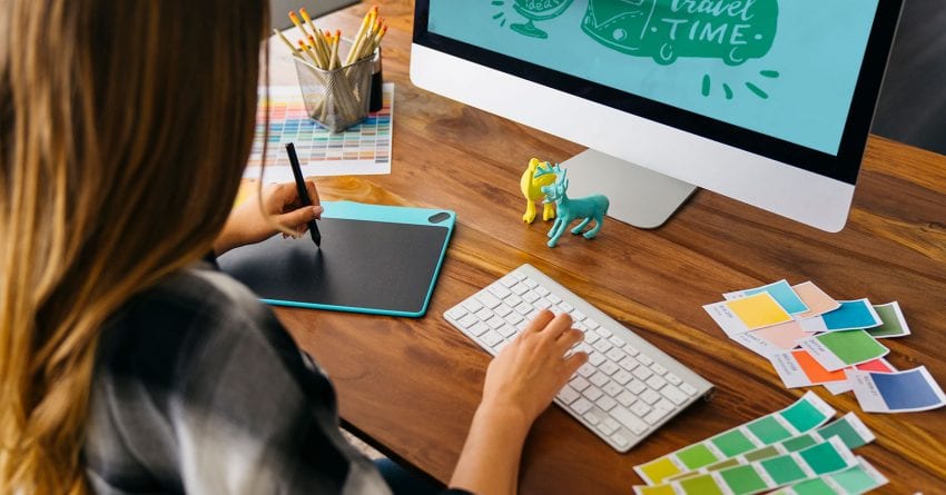
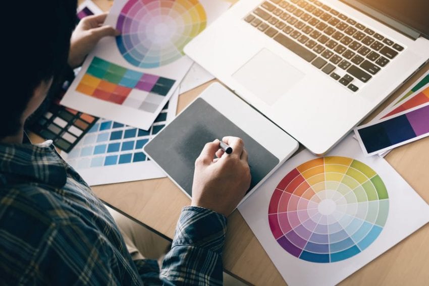
This should be your first point of focus. Remember all great designs have a great color combination. And, that is definitely not a chance of coincidence. If you can choose a color palette that matches with the design, then half of your job is done.
In the event that you are not sure about your discretion in choosing colors, you can take help from some software applications. Those websites will enable you access to a wide color selection. Over there you just have to find a suitable hex code and then start by making a great designing.
- Keep it easy with fonts
In most cases, it has been observed that some graphic designers decide to keep the fonts to 1-2 options only. This is a great choice. It will prevent you from getting carried away. In case, you are using 2 fonts, keep one for the header and the other one for the body. Too much of anything is not good. Keep it simple yet elegant. You may keep the header a bit decorative, whereas the body shall be easy enough for comprehending it by every reader. There should be no instance when readers will face difficulties in reading the content.
- It is okay to blank out
Blank out does not imply on spacing out. It is okay to include white or blank space in your designed file. Though there is no compulsion as such. However, at times keeping less of objects signifies more. It has been observed that sometimes too much design and layouts clutter the image. If you have faced such a situation, then add some white space and enhance the overall look of the poster.
Of course, you need to rack your brain and find out the correct way to adjust the over-done design. In such a situation this simple concept is the need of the hour.
- Keep the objects in alignment
This is a very important tip. You must always aim at keeping all the objects of the poster in alignment. This is to make sure that they are placed in a visibly presentable order, irrespective of their various sizes. Professional graphic designers use this strategy to give their work a sophisticated look. Also, there are various online tools and application available that ensure that whenever you have to drag objects, it comes with grid lines. With the help of these grid lines, you can line up all the objects in a presentable manner.
- Include Icons
You must include icons to convey your message or motto more convincingly. Experts say icons act like that of black pepper. In other words, you can sprinkle it at the top of your crafted design to spice up the look. You can be sure that it will not only look but also taste great. Icons are used professional designers to reinforce the main theme of the blogs or posts. In case, you are not sure which icons will go best with your art, you can take help from the tools available on the web.
- Make your own rules
There are no rules that can put artist and designers in confinement. Set your own rules and follow them. If you have made up your mind, then give it up on them. If you are doing it for a client, you are most likely to get a theme to work on. The designing is in your hand. Remember you are the designer; hence you know what they don’t. Be persistent with your own set rules and bring out that consistency along with creativity in the poster. Keep it the client’s way, but do it your way.
- Copy and Swap
To make your work a smidge easier, you can use your previously designed imaged and use them in the future. Copy the design and rinse the elements that you don’t want in it. In the first place, you don’t have to work hard again to make the same format. Keeping the format same, you just have to filter the unnecessary objects and place the new ones. However, keep in mind you can copy images from others or provide plagiarised content to your clients. That may lead to legal troubles which you would probably not want. A digital marketing company https://www.bigdropinc.com/ can provide you with graphic designing services along with other related packages.
- Adjust the brightness to add texts on pictures
This a little trick which is really beneficial. By reducing the brightness level of the present background image, you can add texts on top of that. This is a great way to offset the color of the font text. The message is not only readable but also clear.
Hopefully, you will use these tips and suggestions while you plan to do graphic designing. Graphic designing is not an easy task, but it is definitely fun and challenging. Enhance your graphic designing experience and have a great time.


